

“Half the money I spend on advertising is wasted.”
“…the trouble is I don’t know which half,” uttered back in the 1800s by John Wanamaker, the Philadelphia marketing pioneer whose department stores ultimately became part of Macy’s; Wanamaker’s words still ring true today. Ironically, at the exact time prospective new home buyers are actively seeking information to help them make the best new home purchase, too many messages fail to engage.
Left-brain/right-brain theory suggests words and information reside in the left hemisphere of the brain, associated with logic and rational thinking. Sometimes called the “emotional brain,” the right hemisphere is home to pictures, feelings, and her sense of identity. And we know buyers buy on emotion and subsequently justify those purchase decisions rationally. I’m an avid reader of Motor Trend. Many of the car ads are predictable – a beauty shot of the automobile, some text… Would anyone really notice if you were to swap out the photo of the car and the manufacturer ID? However, Volkswagen’s ad for their parking assist was different: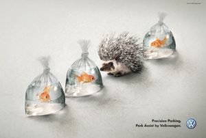
This Volkswagen ad doesn’t even show the product! Rather, it addresses a feature (Park Assist), implies the benefit (making parallel parking safe and easy), and is emotional (humorous).
Okay, your turn. Much home builder advertising seems almost “templated,” focused on a beautiful photo of the home (exterior or interior), informative text meant to differentiate, and company identification. The beauty photo might attract attention, but is the ad memorable and engaging?
Alternatively consider:
Main visual: Worried, wide-eyed 8-year old. Headline: “Mom, have you seen my _____?” Secondary visual: The lockers/cubbies in the rear foyer of your home. Secondary 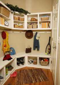 text: Cubbies/lockers provide organization, helping get everyone out the door on time in the morning.
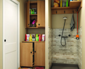
Main visual: Woman wrapped in towel, smiling, standing in entry to door-less walk-in shower, holding squeegee. Headline: No door to clean! Secondary visual: Bathroom layout illustrating walk-in shower. Secondary text: Giving you back a little more time.
 Main visual: Baby napping. Headline: Another reason to chose the “Serenity Package.” Secondary text: Peace and quiet is a beautiful thing. You’ll never regret opting for the Serenity Package with (highlight a few of the product upgrades included, such as quiet appliances, bath fans, garage door opener, etc.).
Main visual: Adorable, muddy dog staring up at you. Secondary visual: Your home’s optional pet center. Text: Appreciating everyone in your household.
Each of the above examples delivers on one of home buyer’s most-desired benefits – reducing stress. While most builders touting “quality-built,” “industry-leader,” and “customer-focused,” are essentially wasting their advertising dollars (what builder doesn’t say those things?). Ads focused on the concepts and benefits customers seek, without the overused exterior/interior beauty photos are emotional, engaging, and drive decision making!
In addition to innovative home plans, Design Basics can help you develop compelling ads that work. Let’s talk!